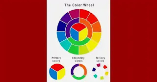
Tertiary colors in the color wheel, using tertiary colors to coordinate colors
Three color set:
A tertiary color scheme is a color scheme that uses three colors that are evenly spaced on the color wheel. It can be used in artwork to create a striking effect, especially when used with other schemes such as complementary or complementary split. The trinity of colors used in the triadic color scheme creates a strong contrast between them. This creates a bold design that is easy to read and understand. The three colors are arranged in an equilateral triangle, meaning they are placed equidistant around the circle.
The reason behind this is that when you use all three colors evenly, you get a smooth transition from one color to another. When evenly spaced, they can also be used as background or foreground colors. The tertiary color palette provides an excellent background for images that contain strong primary colors such as red, yellow, and blue. It also works well with images that contain more subtle shades of these primary colors like green, purple, and orange.
The concept of tertiary color schemes actually dates back to the 19th century, when artists began experimenting with how to use three colors to achieve the best effect in their work. This idea was later transposed into modern art and design. The triangular color palette is one of the most popular choices for home decor as well as for fashion and advertising. It's also very easy to create on your own with a basic knowledge of color theory.
The reason tertiary color schemes are so popular is that they don't just look good; It's also very functional! With three evenly spaced colors on the color wheel, you can achieve a wide range of effects from neutral shades to brights and everything in between. And if you want even more variety, just add another shade to your palette or swap out every third shade with a secondary shade that complements it perfectly.
Triads in the color wheel:
It is especially useful for creating a sense of unity, harmony and balance in works of art. For example, if you are painting a landscape with trees and grass as the main subject, you can use yellow for the grass, green for the trees, and blue for the sky. This will create a strong sense of balance between the three colors. It can be described as a combination of complementary and similar colors.
Another common use for this type of color scheme is to add interest or contrast to your design. For example, if you are drawing a picture of a person wearing red clothes and black hair, you can use blue as the background. This will add some interest to the room by contrasting it with the person's clothing and red hair. It is also known as the desaturated color palette because it only uses three colors, but without a hint of blue or green. Tertiary color schemes are often used in artwork because they are visually appealing and easy to create. This particular triadic color scheme uses three colors that are evenly spaced on the color wheel: red, yellow, and blue.
The tertiary color system consists of three primary colors (red, yellow, and blue) with two secondary colors (orange and green). The third secondary color is purple, in the middle between the two secondary colors. This means that each triad will have its own unique hue value relative to the hues of its corresponding primary and secondary colors. The ternary color scheme is often used as an example of how to create balance in artwork by using three different colors that are evenly spaced on the color wheel. With this method, you can create an image that has a sense of harmony with itself because all three shapes are used in a balanced way throughout your artwork.
The importance of tertiary colors in the color wheel:
Triads are often used for backgrounds or strong graphic elements in illustrations or logos where they create visual interest without adding much color to an image. They can also be used to add depth to a multi-toned image and give a sense of balance in a composition.
The main purpose of using this type of color scheme is to create a balance between warm and cool tones by using reds in the upper left corner of your illustration triangle, yellows in the midtones, and blues in the lower right side of the triangle. . This gives you a sense of the contrast between warm and cool tones without making it too intense or overwhelming for the viewer.
The triangular color palette can be used in any type of artwork, be it painting or drawing. Some artists use this type of color scheme when they want to create an image that is colorful and vibrant, but still has a certain classic feel to it. The triadic color palette will give you plenty of options for creating any type of artwork, as long as you use enough contrasting colors that they don't look dull or unnatural.
Some famous artists who used tertiary color schemes are Vincent van Gogh (Sunflowers), Henri Matisse (Dance) and Mark Rothko (Untitled). These artists were drawn to this scheme for its ability to produce vibrant compositions while maintaining visual balance. When using a tertiary color palette, it can be useful to choose the primary or secondary colors from the chosen hue group. This will ensure consistency throughout the piece. It can also be helpful to vary the intensity of each color to add depth and interest to the final product. Experimenting with different combinations will yield unique and visually appealing results perfect for any artistic medium.
Learn more:

إرسال تعليق